Messages in bottles
Natalie E. Wright
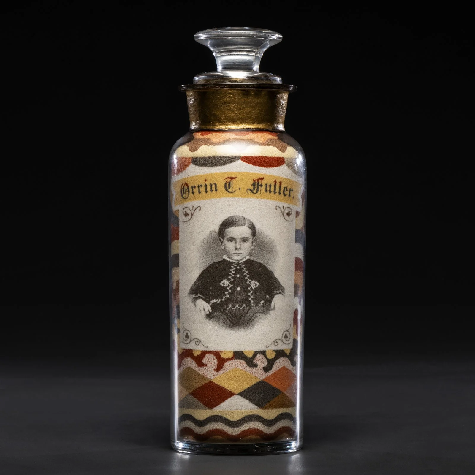
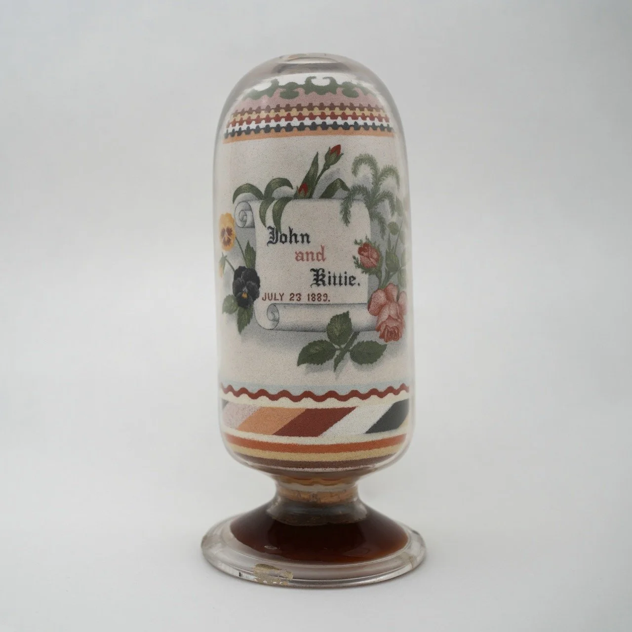
Andrew Clemens (American, 1857–1894), Sand bottle (Mr. & Mrs. J. Allen), 1887. Naturally colored rock sand in glass pharmacy bottle. 8.38 x 3 in. (21.29 x 7.62 cm). Photo courtesy of Freeman’s | Hindman.
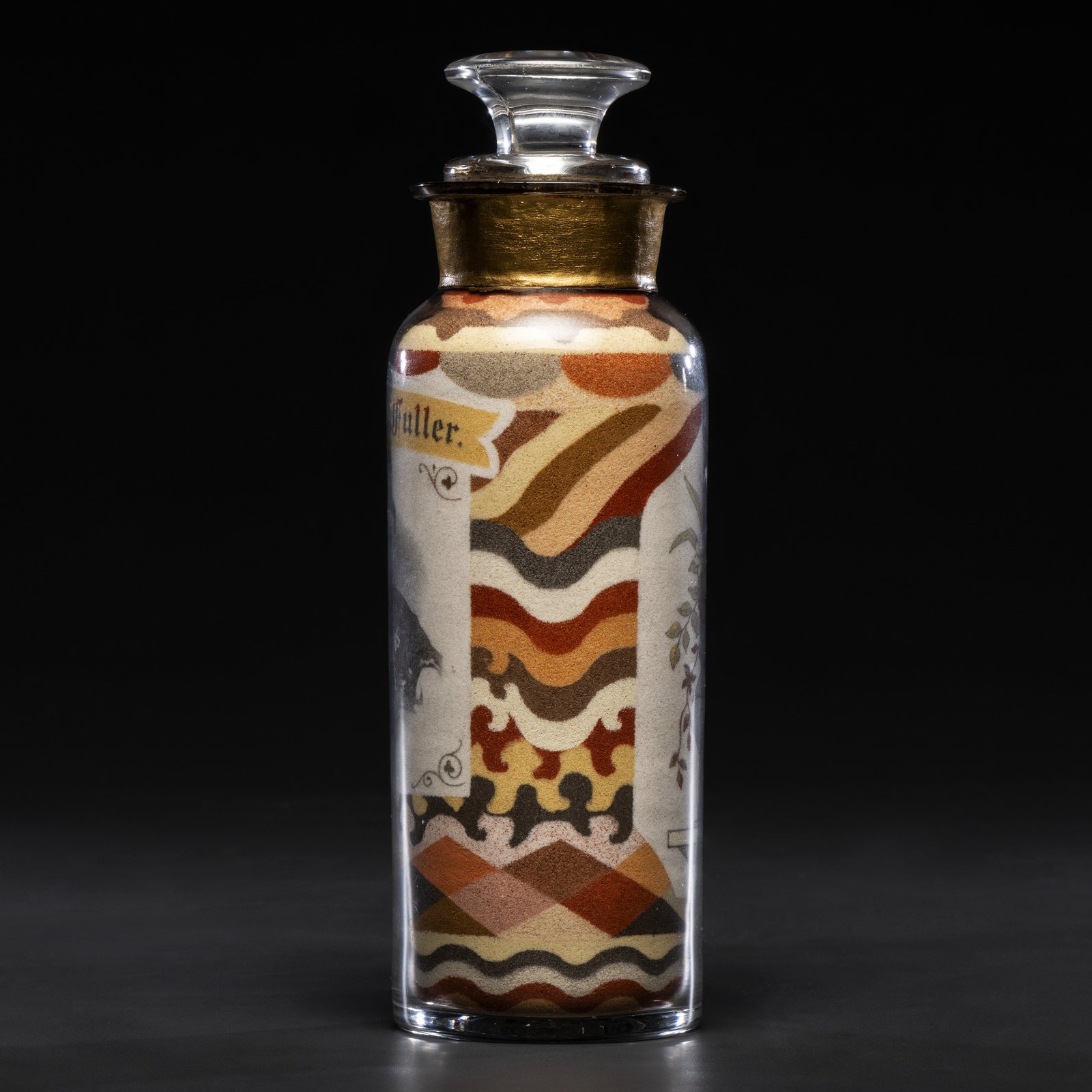
Pictured Rock Sand. That is what artist Andrew Clemens called his unique creations: intricate images held in glass bottles, made using nothing but naturally colored sand. He collected his materials in his native region of McGregor, Iowa, where minerals in the groundwater dyed the exposed sandstone, sorting the pigmented sand into more than forty separate colors. Working with this palette, Clemens brought his art to a high state of perfection during his too-short life. His active years were roughly 1871 to 1894, during which time he developed remarkably quickly, from simple designs to extraordinarily detailed compositions incorporating lettering, portraits, animals, floral arrangements, locomotives and ships, eagles, flags, and more. As industry expanded up the Mississippi River into northern Iowa, Clemens created custom and souvenir pieces for locals and visitors alike.
Clemens’ work was so unusual and precise that he had to create his own tools and processes. He used long, thin pieces of hickory wood fashioned with various ends to add, move, or pack sand into pharmaceutical bottles—a good choice, as they were designed to keep moisture away from pills, and the sand absolutely had to stay dry. He needed no adhesives—a point he proved when performing at Dime Museums across the United States by breaking the bottles and allowing the sand to pour out. But some of his work was destroyed unintentionally: the mold-blown bottles could shatter unexpectedly when Clemens pressed the sand down tightly during the final, heart wrenching stages of a piece, before he sealed it with a stopper. Turn one over and give it a hard shake, and it would be irreparable.
Andrew Clemens (American, 1857–1894), Sand bottle (Mr. & Mrs. J. Allen), 1887. Naturally colored rock sand in glass pharmacy bottle. 8.38 x 3 in. (21.29 x 7.62 cm). Photo courtesy of Freeman’s | Hindman.
As Clemens’ creations gained recognition, viewers tried to categorize them in terms of other, more familiar art forms. The obituary that ran in his hometown newspaper, for example, noted that “He was a portrait painter without a brush or even paint.” Today, Clemens’ work has once again piqued buyers’ interests. Bottles at auction are reaching prices in the hundreds of thousands—a far cry from their original prices of up to five dollars. Comparisons with painting are still frequently made. But what if his sand pictures are actually more printerly than painterly?
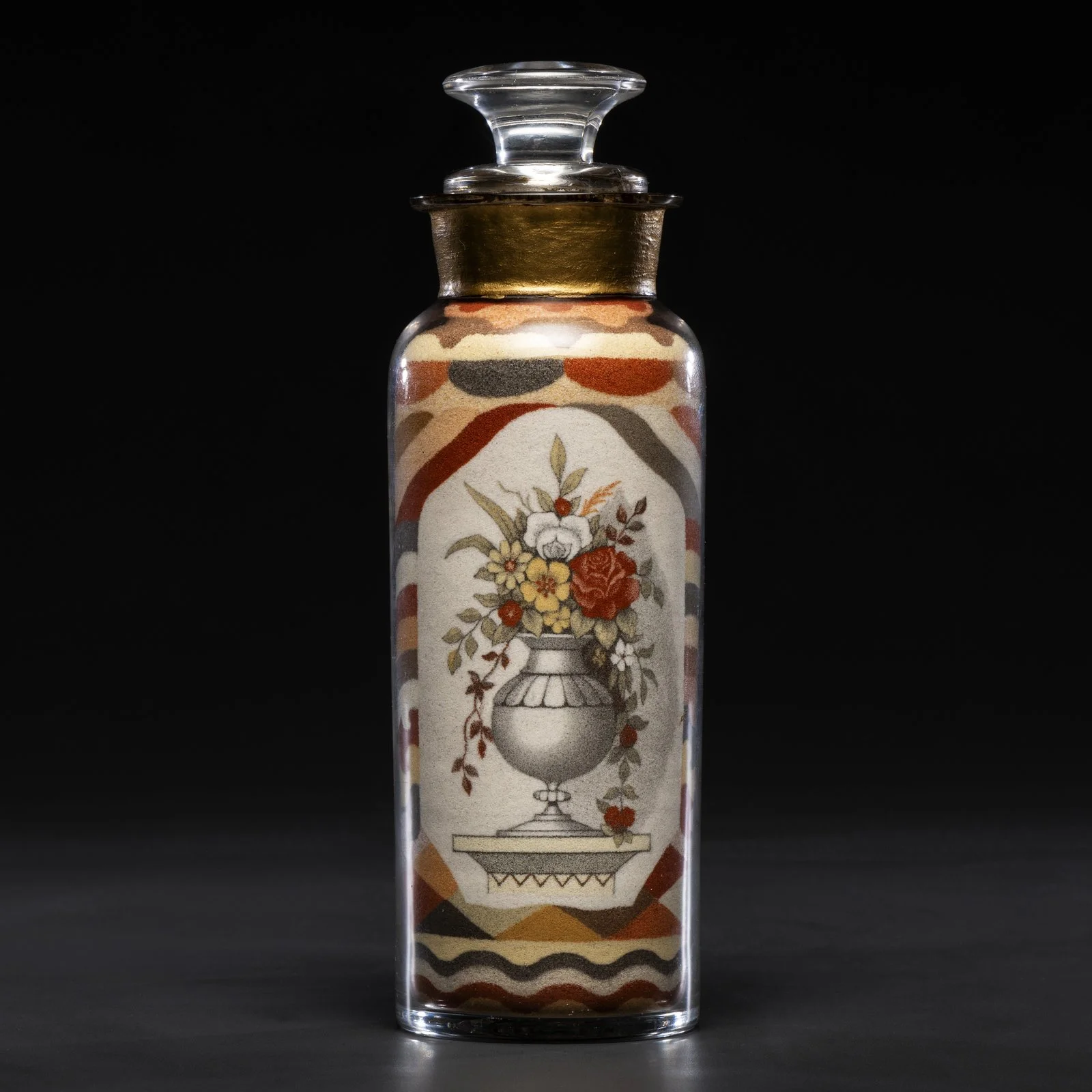
Visually, many of Clemens’ pieces resemble Victorian trade cards. These were a form of collectable advertising that boomed in popularity across the United States after the Civil War, particularly during his active years. With the invention of chromolithography, printers could suddenly create full-color designs. Chromolithography, however, was best at printing solid areas of color and relied on other techniques such as stippling, crayon drawing, and Ben Day dots to create shading. Clemens cleverly approximated this look in sand by exploiting its “grainy” aesthetic. He also mimicked trade card compositions. Many of his bottles feature quintessential trade card elements such as text on an illusory scrap of paper surrounded by floral arrangements, sailboats and ships, as well as the playful use of shadowing to evoke three-dimensionality.
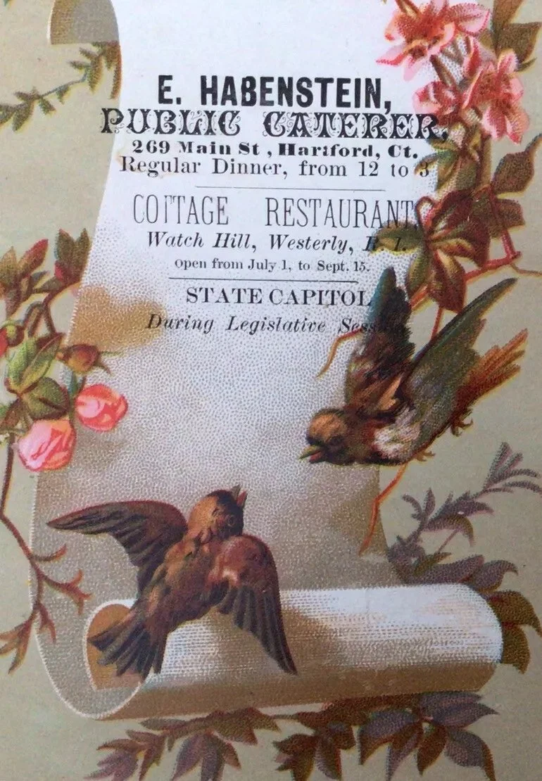
Trade card, “E. Habenstein Public Caterer,” ca. 1890. Chromolithograph. 3.5 x 5.5 in. (8.89 x 13.97 cm).
Andrew Clemens (American, 1857–1894), Sand Art - Sailing Ship, John and Kittie, July 23, 1889, 1889. Naturally colored rock sand in glass pharmacy bottle. 8.75 x 3.5 in. (22.23 x 8.89 cm). State Historical Museum of Iowa, Des Moines, 1401.
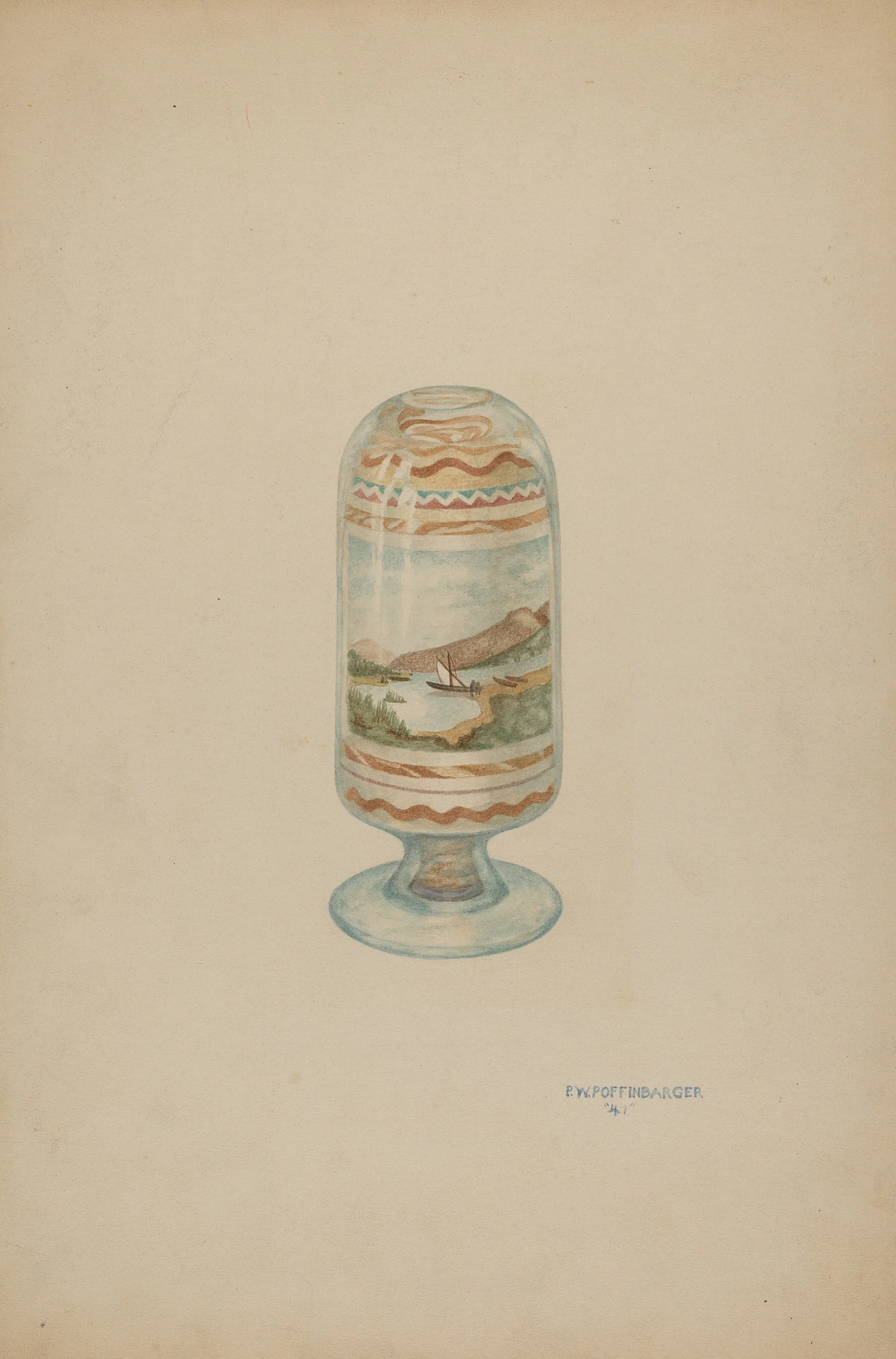
Paul Poffinbarger (American, 1916–1982), Sand Picture, ca. 1941. Watercolor and graphite on paperboard. 15.06 x 10.06 in. (38.3 x 25.5 cm). National Gallery of Art, 1943.8.12843, Index of American Design.
The background designs in Clemens’ bottles recall marbled paper, not only showing off his color sorting and mixing skills, but also his uncanny ability to achieve complex curved lines. In some of his later works he even seemed to be making tiny geological formations, replicating the source of his sand in miniature. The artist Paul Poffinbarger partially rendered this effect in watercolor when he depicted a Clemens bottle in 1941 for the Index of American Design.
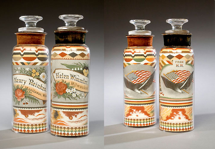
To achieve this extreme complexity Clemens began to grind his sand finer and finer, until it was essentially pigmented dust. He used this technique to create, for example, a portrait of a little boy named Orrin T. Fuller, as well as photo-realistic depictions of an Irish red and white setter dog, and even a “dipper dredge” barge. His command of text was also masterful. He could move from bold, newspaper-like gothic fonts to a fine pen-and-ink-style cursive. But if he misspelled a word—“Manitowoe” instead of Manitowoc, Wisconsin—there was no fixing the error.
As a self-identified “deaf mute” man, Andrew Clemens communicated by reading lips and writing things down. He’d lost his hearing after a case of “brain fever” at six years old. His childhood happened to coincide with a push for deaf education, and he attended the Iowa Institution for the Deaf and Dumb at Council Bluffs from the ages of thirteen to twenty. His curriculum there emphasized “constant practice in written language,” with all pupils “exercised largely in school-hours in written composition,” according to one Institute report. This accommodated hearing persons who were never expected to learn ASL. At the same time, printing was also becoming a “traditional” deaf occupation; indeed, Clemens’ school was founded partly in response to the advocacy of Edmund Booth, a leader in the deaf community and owner of a local newspaper.
Clemens’ use of writing as a primary means of communication is reflected in his work. He ultimately built a business and an oeuvre out of helping others to express themselves through inscriptions to loved ones, friends and colleagues. Clemens created messages in bottles, impossibly fragile, but still there to be seen and read once more.
Andrew Clemens (American, 1857-1894), Sand bottle (Williams and Upham Contractors for River and Harbor Improvements), ca. 1884. Naturally colored rock sand in glass pharmacy bottle, 8.75 x 2.75 in. (22.23 x 6.99 cm). Photo courtesy of Freeman’s | Hindman.